Brand Identity Systems
End-to-end brand identity systems — logo, typography, colour, and comprehensive guidelines.
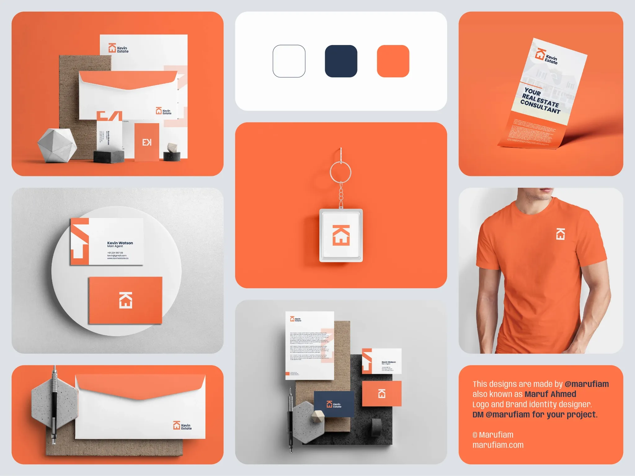
A strong brand identity is the foundation everything else is built on. Over 10+ years, I have developed complete brand identity systems for startups, established businesses undergoing refreshes, and everything in between. Each system goes beyond a logo — encompassing typography hierarchies, colour palettes with accessibility ratios, iconography, photography direction, and detailed usage guidelines that ensure consistency across every touchpoint from business cards to billboards to digital interfaces.
Strategic Brand Development
Identity systems built on strategy, not just aesthetics.
Every brand identity project begins with discovery — understanding the business positioning, target audience, competitive landscape, and long-term vision. The visual identity is then developed to communicate the right attributes and differentiate from competitors. This strategic foundation ensures your brand works harder: it attracts the right customers, repels poor-fit customers, and gives your team a clear north star for all future design work. A strong brand identity increases perceived value, allows price premiums, and creates loyalty that transcends product features. For Gold Coast businesses competing in crowded markets — trades, real estate, hospitality, professional services — a distinctive visual identity becomes your competitive moat.
What's Included
Complete brand packages delivered with full guidelines.
Every brand identity system I deliver includes: primary and secondary logo variations (full colour, mono, reversed, stacked, horizontal), a defined typography system with primary and secondary typefaces including web-safe fallbacks, a colour palette with HEX/RGB/CMYK/Pantone values and accessibility-tested combinations, custom iconography or icon style direction, photography and imagery guidelines, and clear spacing and minimum size rules. The depth of a brand identity system is often underestimated — getting typography right alone requires understanding weight hierarchies, line-spacing, and how different typefaces pair and perform across devices. Colour systems must account for accessibility (contrast ratios), print reproduction (CMYK vs RGB), and psychological associations that vary across cultures.
The final deliverable is a comprehensive brand guidelines document (typically 20-40 pages) that serves as the single source of truth for anyone producing materials for the brand — whether that's an internal team, external agency, or printer. I also provide all assets in production-ready formats: vector logos (SVG, AI, EPS), rasterised versions (PNG at multiple sizes), favicon packages, social media templates, and business card/letterhead layouts ready for print. The deliverables package covers every application a brand might need: website styles, email templates, presentation decks, social media graphics, vehicle wraps, signage, merchandise, packaging, and more. By the end of a brand identity project, you have a system comprehensive enough that a new team member can produce on-brand materials without ever talking to a designer.
Logo Design and Mark Development
Distinctive marks that communicate at every scale.
The logo is the visual anchor of a brand identity. I develop logos that work at multiple scales — large on billboards, small as a favicon, and everywhere in between. Good logos are simple enough to draw by hand, distinctive enough to stand out in a crowded marketplace, and scalable to every possible application. I typically develop 3-5 concepts that explore different directions, then iterate on the strongest direction through multiple rounds of refinement. Favourite mark solutions get tested across applications: What does it look like on a website? On a business card? On a vehicle wrap? Does it still communicate when reduced to 16x16 pixels? Only after rigorous testing across contexts does a logo get locked in. The result is a mark that becomes instantly recognisable and appropriate everywhere your brand appears.
Colour Palettes and Psychology
Colours that communicate your brand personality.
Colour is one of the most powerful brand tools available. Colour associations vary globally — red is lucky in China but aggressive in Western contexts. Blue feels corporate and trustworthy. Green suggests sustainability. I develop colour palettes that align with your positioning while standing out against competitors. A complete colour system includes primary colours (your signature hues), secondary colours (supporting palette), neutrals for typography and backgrounds, and often accent colours for CTAs and highlights. Every colour is specified in multiple formats: HEX (web), RGB (video), CMYK (print), and Pantone (outdoor/signage). Importantly, I validate every colour combination for accessibility — making sure text contrast meets WCAG standards so your materials remain readable for people with colour blindness or low vision. For any brand operating online, accessibility isn't optional; it's essential for both ethics and legal compliance.
Typography and Hierarchies
Reading systems that work at every size.
Typography is half of graphic design. The typefaces you choose communicate personality and set expectations. Serif typefaces feel traditional and trustworthy. Modern sans-serifs feel clean and contemporary. Script typefaces can feel elegant or playful depending on weight and style. I select typeface pairs that complement each other, work well together at different sizes, and perform reliably across web and print. A complete typography system defines: primary typeface (often used for headlines), secondary typeface (body copy), weight variants (regular, bold, etc.), and size scales. The size scale maps semantic levels (H1, H2, body, small text, etc.) to specific pixel sizes that maintain readability while creating visual hierarchy. On web, typography also considers performance — I specify web-safe fallbacks so pages remain readable if custom fonts fail to load, and I optimise font loading to avoid rendering delays. Good typography becomes invisible; readers focus on content rather than the letter forms delivering it.
Need a brand identity system?
Let's connect.

From the blog
Latest thinking
Tech news, design insights, and development deep-dives from the Gold Coast.