


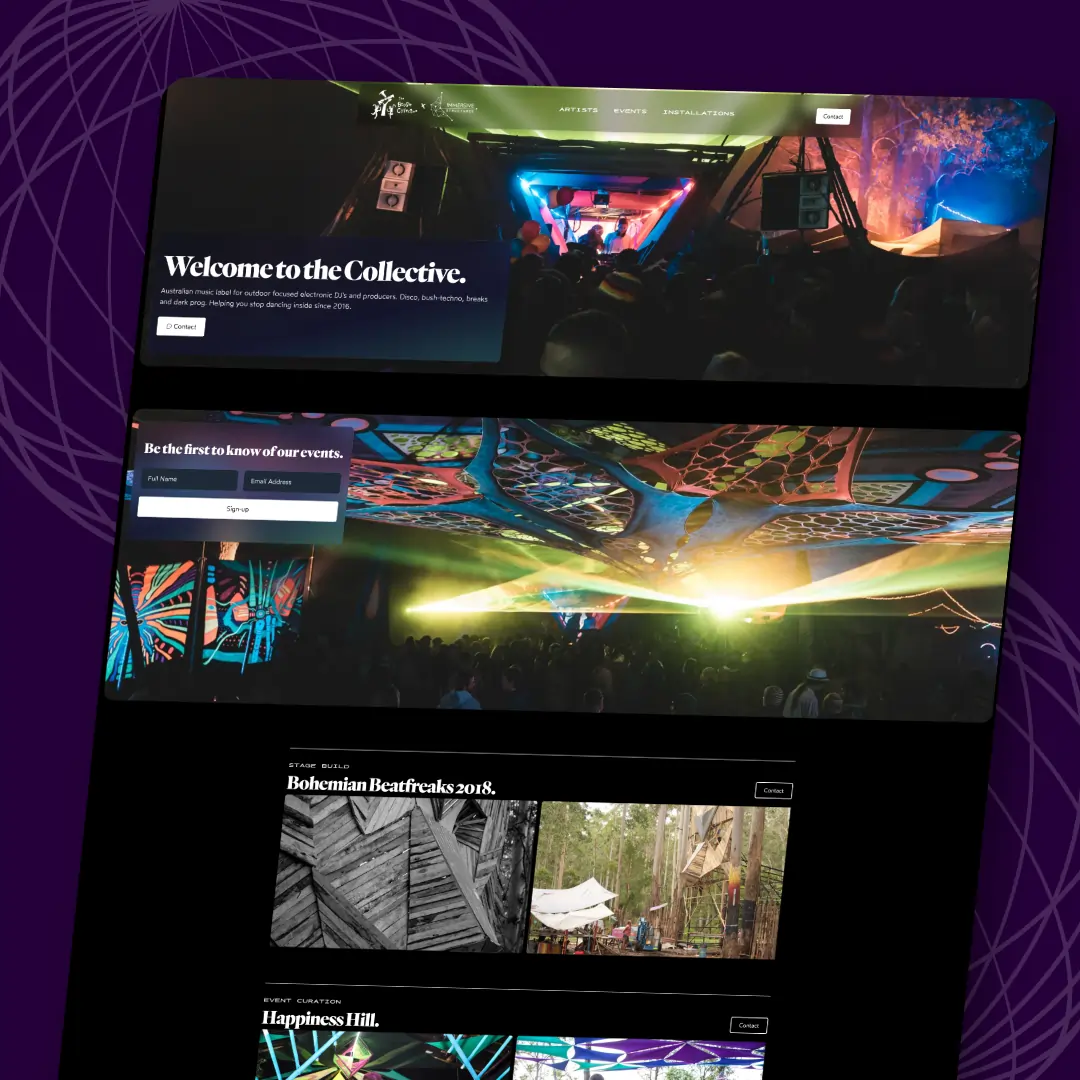
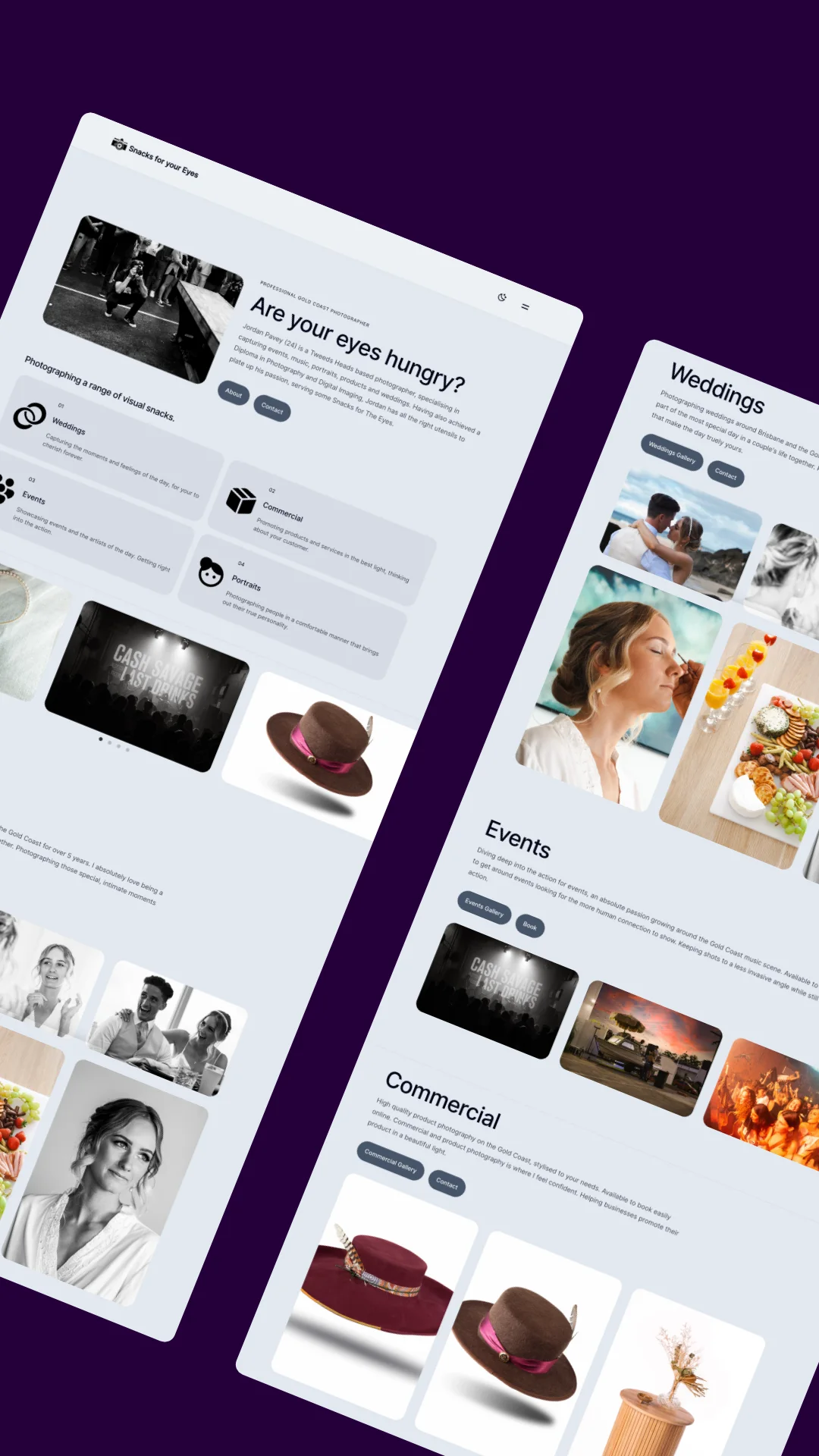




The 100vh hero with a centred headline and 40% empty space is the default template move, and the best product sites quietly stopped doing it years ago. Look at Stripe, Linear, Vercel: heroes sized to their content, proof close behind, next section visible at the fold's edge like a trailer for the rest of the page.
Velocity X's hero family — hero-centred, hero-split-image, hero-gradient-mesh, hero-email-capture — is built on that read. All .astro, all static HTML and CSS, because a headline does not need hydrating.
The Money Pattern
Two numbers carry the whole composition. Padding that fits the content, and a headline-to-subhead delta around 3.5–4×:
<section class="px-6 py-20 sm:py-28">  <!-- not min-h-screen -->
  <div class="mx-auto max-w-3xl">
    <h1 class="text-5xl sm:text-7xl font-semibold tracking-tight">
      Ship the page, not the template
    </h1>
    <p class="mt-5 max-w-xl text-lg text-neutral-500">
      One idea per hero. The subhead qualifies it; the CTA commits to it.
    </p>
  </div>
</section>
7xl against lg is roughly a 4× delta — hierarchy strong enough that nothing else needs decorating. When a hero feels "flat", the delta is almost always 2× and no amount of gradient fixes it.
The Catch
Backgrounds are where hero performance dies. A WebGL mesh behind your headline costs a canvas, a render loop and GPU time for every visitor — and it runs forever in a background tab. hero-gradient-mesh fakes the same depth with layered CSS gradients: zero JS, zero render loop, and it ships as part of the initial paint.
The other tell: two competing CTAs styled identically. One primary action, one quiet text link. If both buttons are solid, neither is primary.
The Verdict
A hero's job is to make scrolling feel inevitable, not to fill a viewport. Content-sized section, 3.5×+ type delta, CSS-only backdrop, one real CTA — the whole discipline in one sentence. The decided versions are in Heroes & Sections, 25 of them, installed as source you own.