



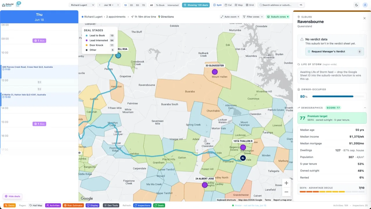


Open any CRM, billing tool or admin and the screen you'll see most is the detail view: one record, fifteen label/value pairs. Customer → email, plan, created date. It looks too boring to design, so nobody does — and the result is div soup where the labels and values have no machine-readable relationship at all.
HTML has owned this shape since 1995: the description list. Velocity X's standard-description-list is the <dl> dressed for an app, with the three details that make detail views actually good.
The Money Pattern
<dl class="divide-y divide-neutral-100">
  {fields.map(f => (
    <div class="grid gap-1 py-3 sm:grid-cols-3">
      <dt class="text-sm text-neutral-500">{f.label}</dt>
      <dd class="sm:col-span-2 text-sm text-neutral-900">
        {f.value ?? <span class="text-neutral-400">—</span>}
        {f.copyable && f.value && <CopyButton value={f.value} label={f.label} />}
      </dd>
    </div>
  ))}
</dl>
The grid-inside-dl gives the two-column label/value layout that collapses to stacked on mobile — re-flow, not hide. And because it's a real <dl>, screen readers announce "email, j@example.com" as a pair instead of two disconnected strings.
The Catch
Empty values are a decision, not an accident. A missing phone number renders an explicit em-dash — never a blank cell (is it empty or still loading?) and never the row silently removed (users scan detail views positionally; a vanishing row moves everything they've memorised). Loading gets the skeleton; empty gets the dash; the two must look different.
Copy buttons go on exactly the fields people steal — IDs, emails, API keys — with aria-label="Copy customer ID" and a visible "Copied" tick. The 80/20 of admin ergonomics is not making someone triple-click-select a UUID.
The Verdict
Label/value screens are a solved semantic (dl/dt/dd) plus three courtesies: explicit empties, copy affordances, mobile re-flow. The dressed version is in Velocity X's Standard Data category — the quiet workhorse next to the tables that get all the attention.