









Carousel engagement numbers are infamous — the overwhelming majority of users never interact, and slide two might as well not exist. So the first honest question about a testimonial carousel is whether the testimonials should rotate at all: three strong quotes in a static grid outperform ten in a carousel almost every time.
But sometimes you genuinely have fifteen good quotes and one slot. Velocity X ships two shapes for that: testimonial-carousel-peek and the minimal testimonial-carousel-single.
The Money Pattern
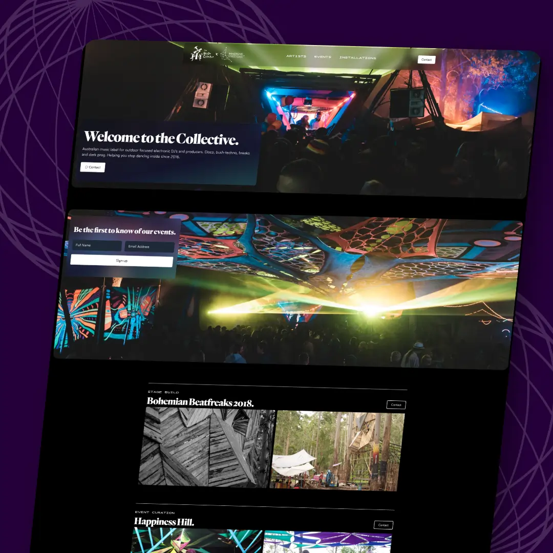
The peek pattern is the single highest-leverage carousel fix: show the edge of the next card, and the carousel stops pretending to be a static image. CSS scroll-snap does all the physics:
<div class="flex gap-4 overflow-x-auto snap-x snap-mandatory
            [scrollbar-width:none] px-[8%]">
  {quotes.map(q => (
    <figure class="snap-center shrink-0 basis-[84%]">
      <blockquote>{q.text}</blockquote>
      <figcaption>{q.name} — {q.role}</figcaption>
    </figure>
  ))}
</div>
basis-[84%] + centred snap = 8% of the neighbouring cards visible on each side. That sliver is the affordance — swipe rates jump when users can see there's more, and no arrow buttons or dot indicators have to carry the hint alone. Native overflow scrolling means touch, trackpad and keyboard all work before you write a line of JS.
The Catch
Auto-advance is where carousels earn their reputation. If you must: pause on hover, pause on focus, pause on touch, stop permanently after any manual interaction, and respect prefers-reduced-motion. A quote that slides away mid-read is worse than no quote — you've shown the user their reading doesn't matter.
Second catch: real names, real faces, real roles. A carousel of "J.D. — Happy Customer" is structurally identical to no testimonials. The component renders attribution as first-class markup (figcaption, not a styled div) because the attribution is the proof.
The Verdict
Grid first, carousel if volume demands it, peek if you carousel, and auto-advance only with the full pause list. Both shapes live in Velocity X's Marketing & Social Proof category with the review walls and trust badges that do the same job standing still.