










Cards & Expandables
Expandable Card
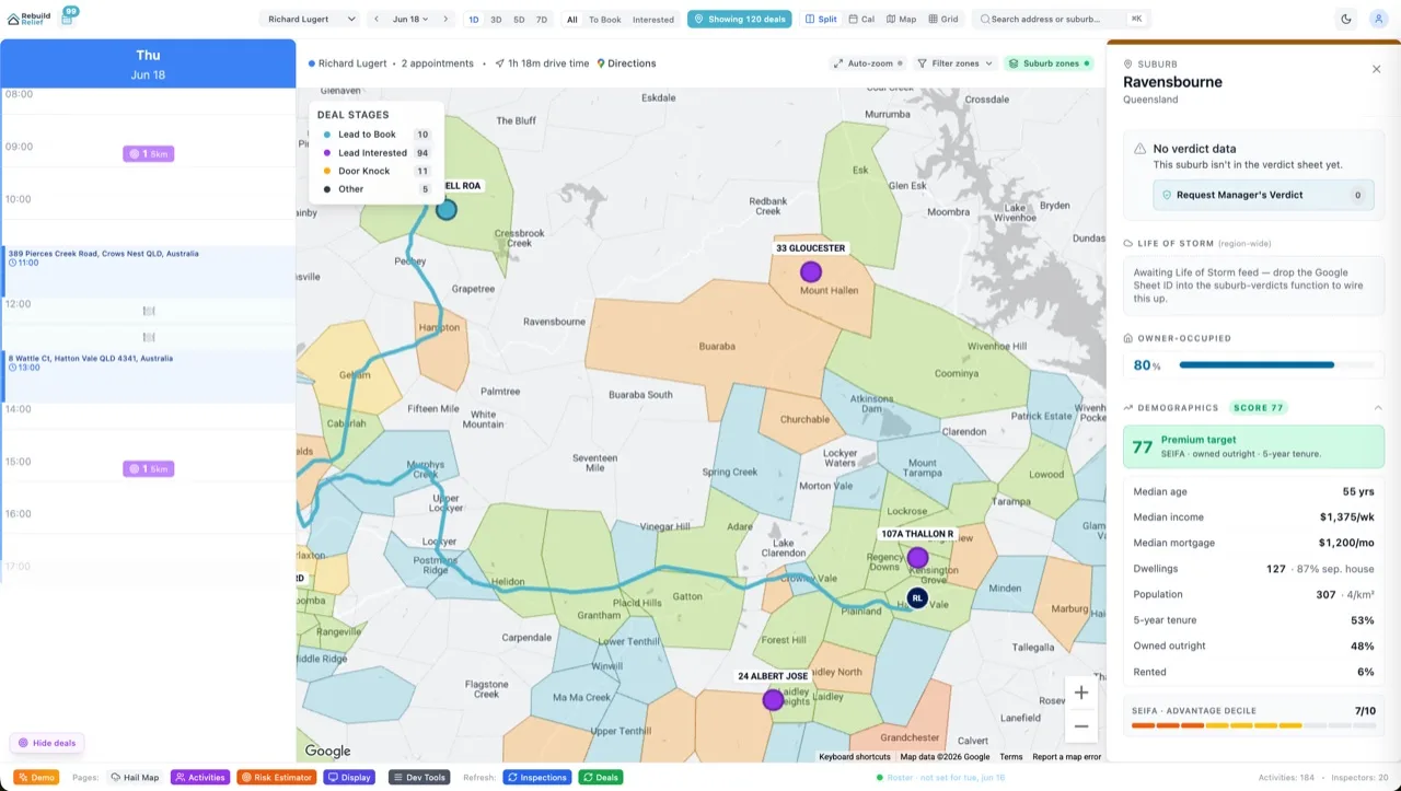
Collapsed tile with a cut-away corner that expands through a portal into a right drawer on desktop or a draggable bottom sheet on mobile. Escape closes it.
Expandable Card
Live preview of the Expandable Card component
Demo
Tap to expand
The code ships with Velocity.
Every component's full source — copy-paste ready, yours to edit — comes with any Velocity package. Buy once, own the code forever.
Get Velocity X — from $1,250 See all packages →Using the Expandable Card component
Card components are React islands that own their own open and closed state, so they hydrate only on the pages where you actually use them. The expanded state renders through a portal rather than inside the card, which is why a drawer or bottom sheet never gets trapped by a parent stacking context. Everything visual is Tailwind utility classes, so the card inherits your brand ramp instead of shipping a palette of its own.