








Feature Sections
Feature Cards
Four-section feature grid of expandable cards, each with its own inline-SVG explainer scene that starts animating only once the card scrolls into view.
Feature Cards
Live preview of the Feature Cards component
Design that converts.
Custom Layouts
Design · Layout
Custom Layouts
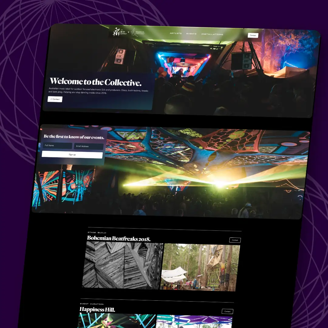
Built around your content.
Responsive Design
Design · Responsive
Responsive Design
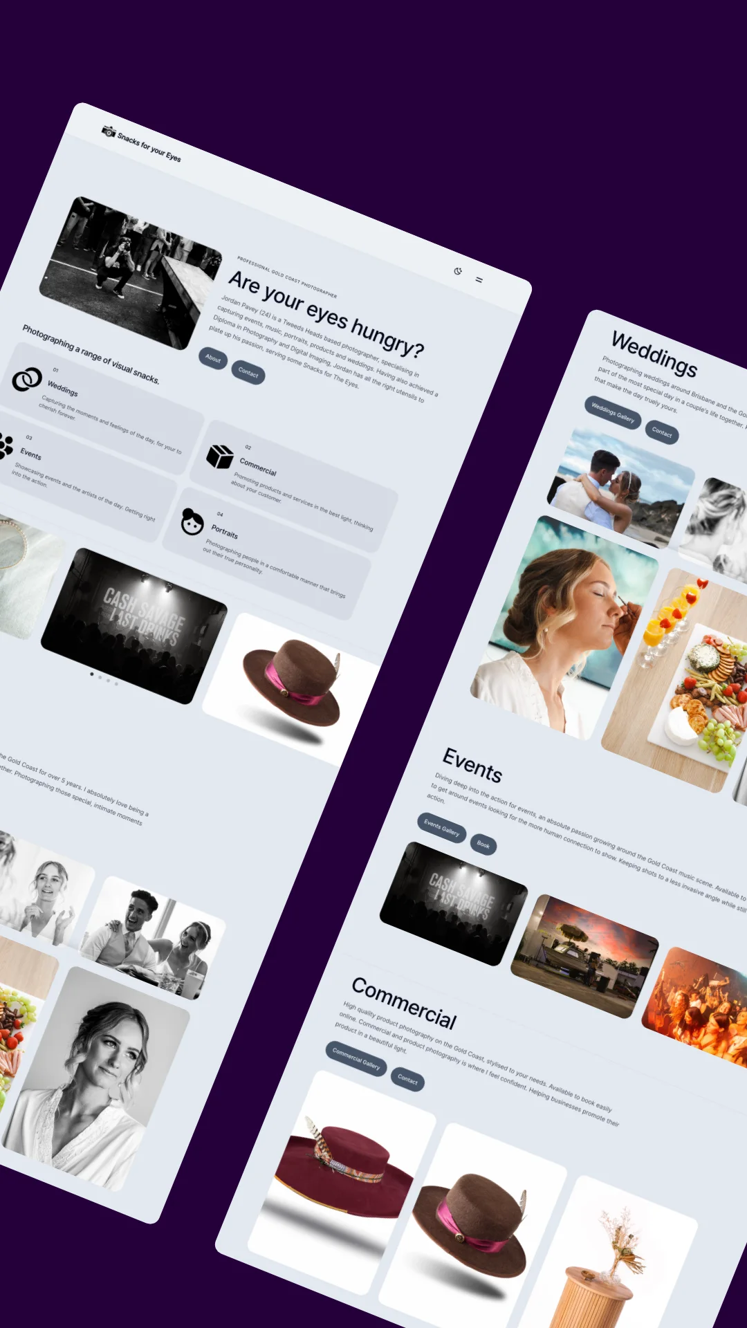
Native on every screen.
Brand Systems
Design · Brand
Brand Systems
One consistent visual system.
Motion & Microinteractions
Design · Motion
Motion & Microinteractions
Movement with a purpose.
Built for speed.
Performance First
Develop · Speed
Performance First
Sub-second loads, every page.
Bidirectional CRM Sync
Develop · CRM
Bidirectional CRM Sync
True two-way pipeline sync.
Multi-Stop Route Optimisation
Develop · Routing
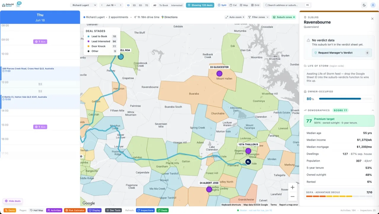
Multi-Stop Route Optimisation
A day's stops, optimised.
Type-Safe Supabase + RLS
Develop · Data
Type-Safe Supabase + RLS
Secure, typed data layer.
Measure everything.
SEO Analytics
Grow · SEO
SEO Analytics
Rankings in one dashboard.
AI Brain Follow-ups
Grow · AI
AI Brain Follow-ups
Every lead followed up.
White-Label Booking
Grow · Booking
White-Label Booking
Self-serve, auto-assigned bookings.
Email Remarketing Flows
Grow · Email
Email Remarketing Flows
Dropped forms become jobs.
Other apps from Aidxn.
MIDI Bridge
App · Audio
MIDI Bridge
F1 controller to MIDI.
TradePilot
App · Trading
TradePilot
One fast trading workspace.
WhisperLine
App · Transcription
WhisperLine
Private, on-device transcription.
Gold Coast City Council
Client · Public sector
Gold Coast City Council
Custom council internal tools.
The code ships with Velocity.
Every component's full source — copy-paste ready, yours to edit — comes with any Velocity package. Buy once, own the code forever.
Get Velocity X — from $1,250 See all packages →Using the Feature Cards component
Feature sections are React components whose animation is tied to the element entering the viewport rather than to a page-load timer, so a long page only pays for the sections somebody actually scrolls to. The illustrations are inline SVG, which means they scale to any width and recolour with the rest of the page.